Adding Texture & Dimension to your Pages with Emma Kate
.
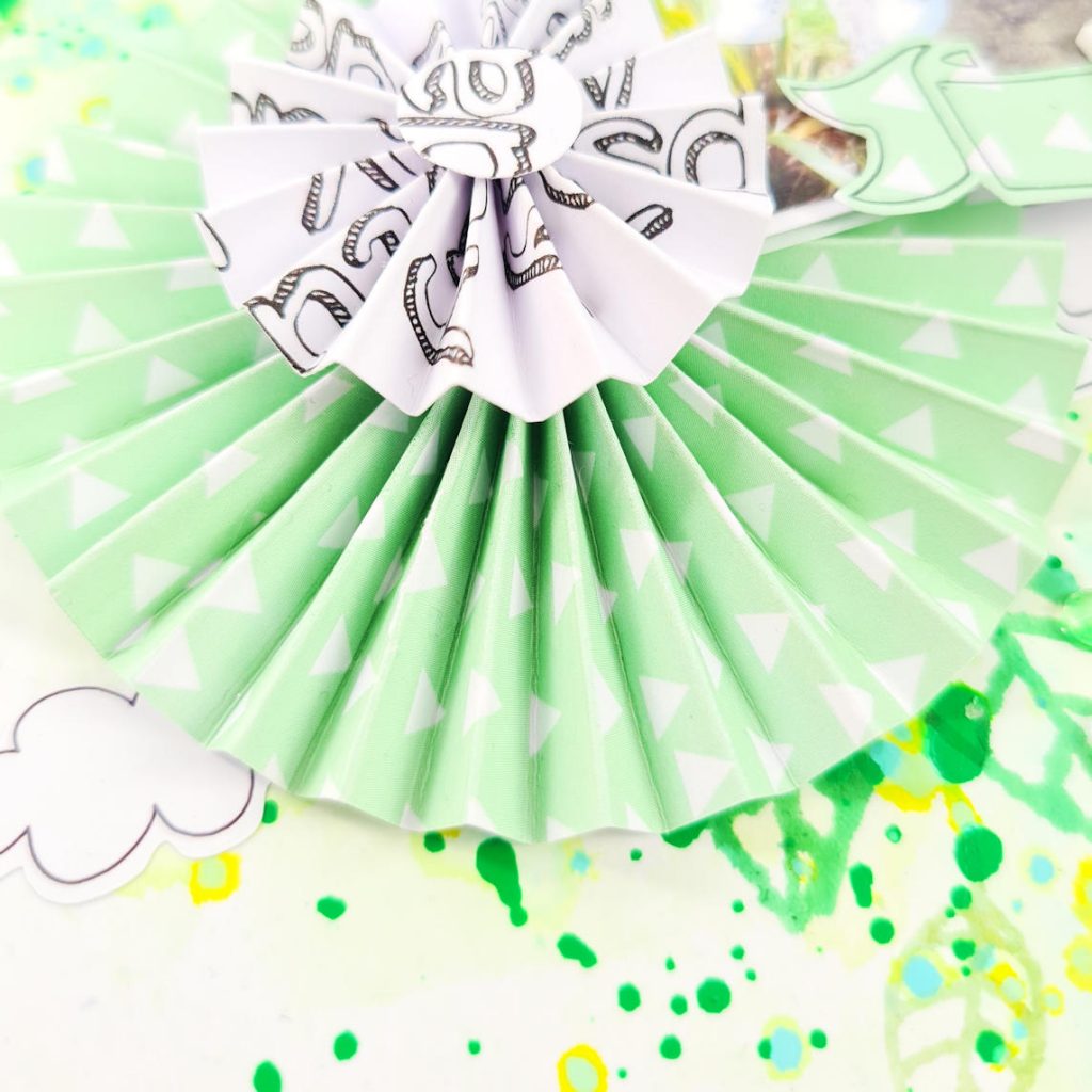
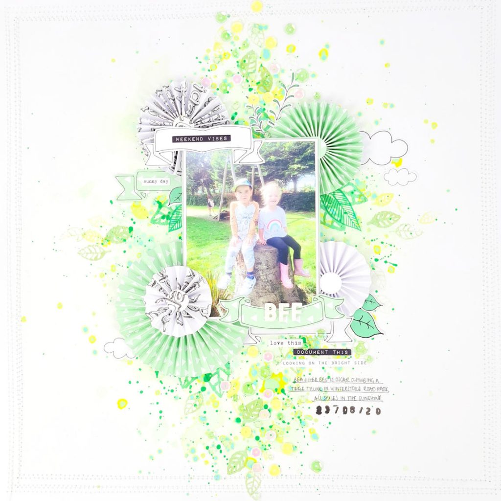
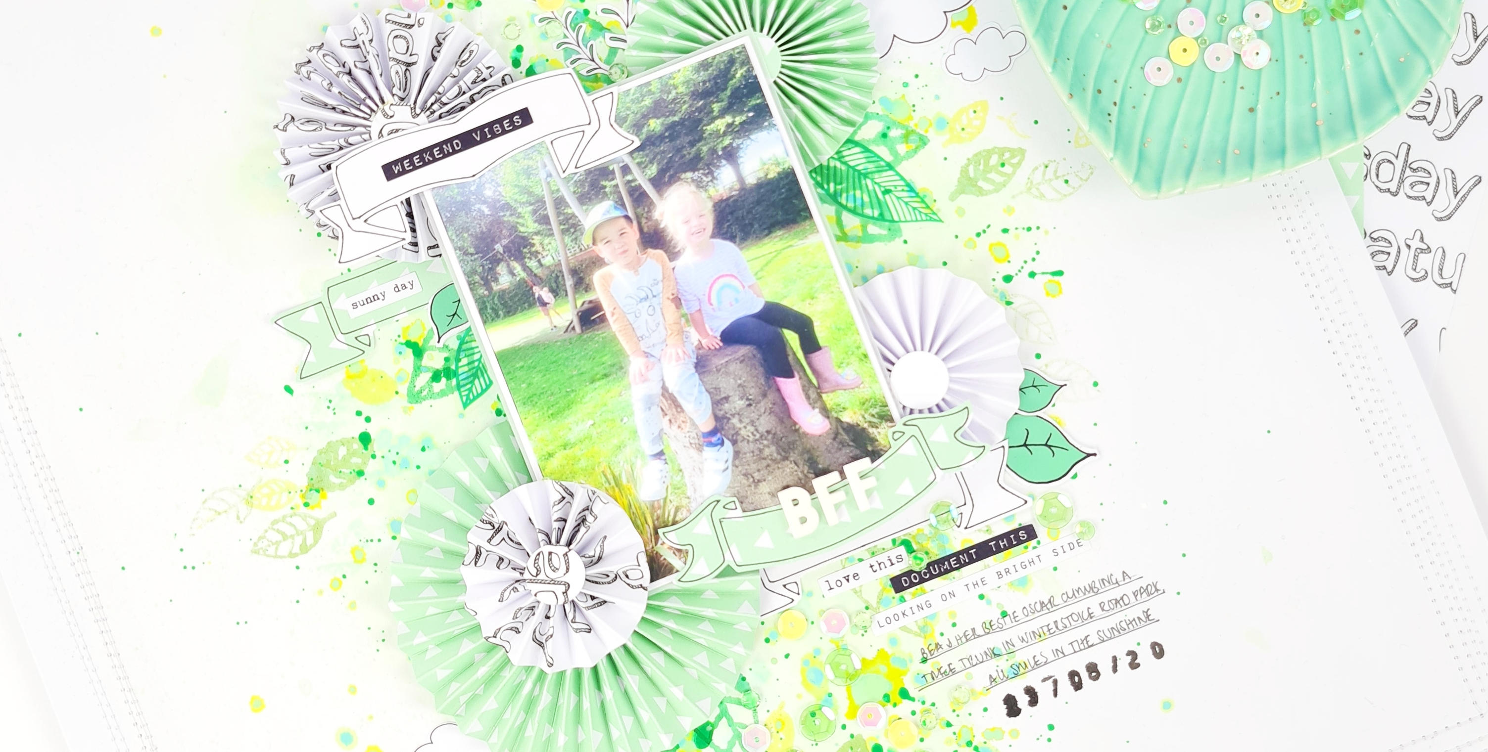
Hey Lollipop friends, today I have a monochromatic 12×12 layout to share with you, all shades of green inspired by the greenery in the photo of my little girl and her bestie sat in the park. I began my layout by creating different sized rosettes using the green & repeated days patterned paper from the ‘Rise & Shine’ kit here, the rosettes give great depth & texture to my page.
.
.
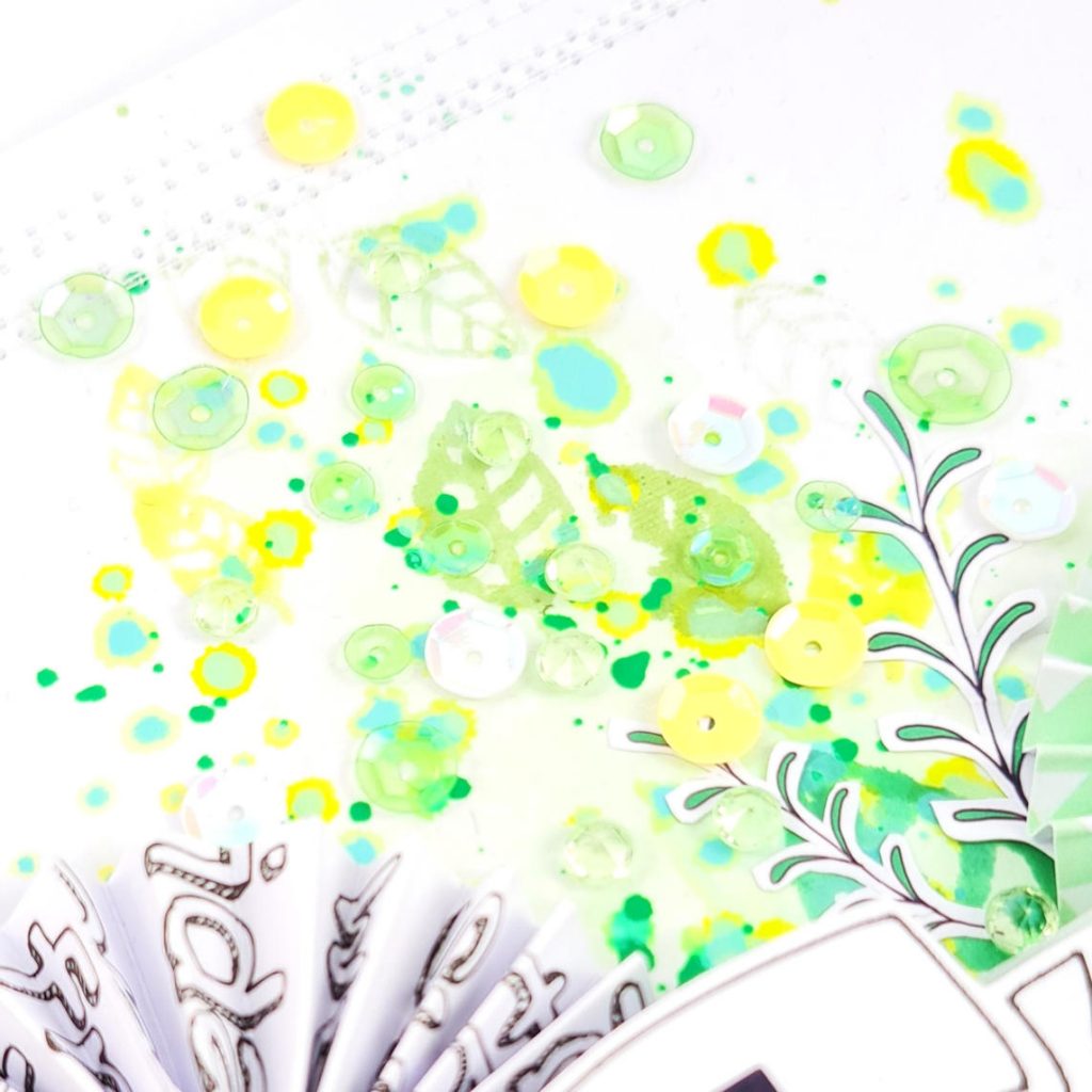
Next I started on my mixed media background using a combination of Distress Oxide Sprays & the packaging technique, once that was completely dry I used a leaf stamp & green inks to add more interest & to mirror the leaf stickers in the kit, plus in the leaves of the trees in the photo. Then using the banner stencil I drew out a handful of banners on the same patterned paper as my rosettes then fussy cut them out.
.
.

.
.
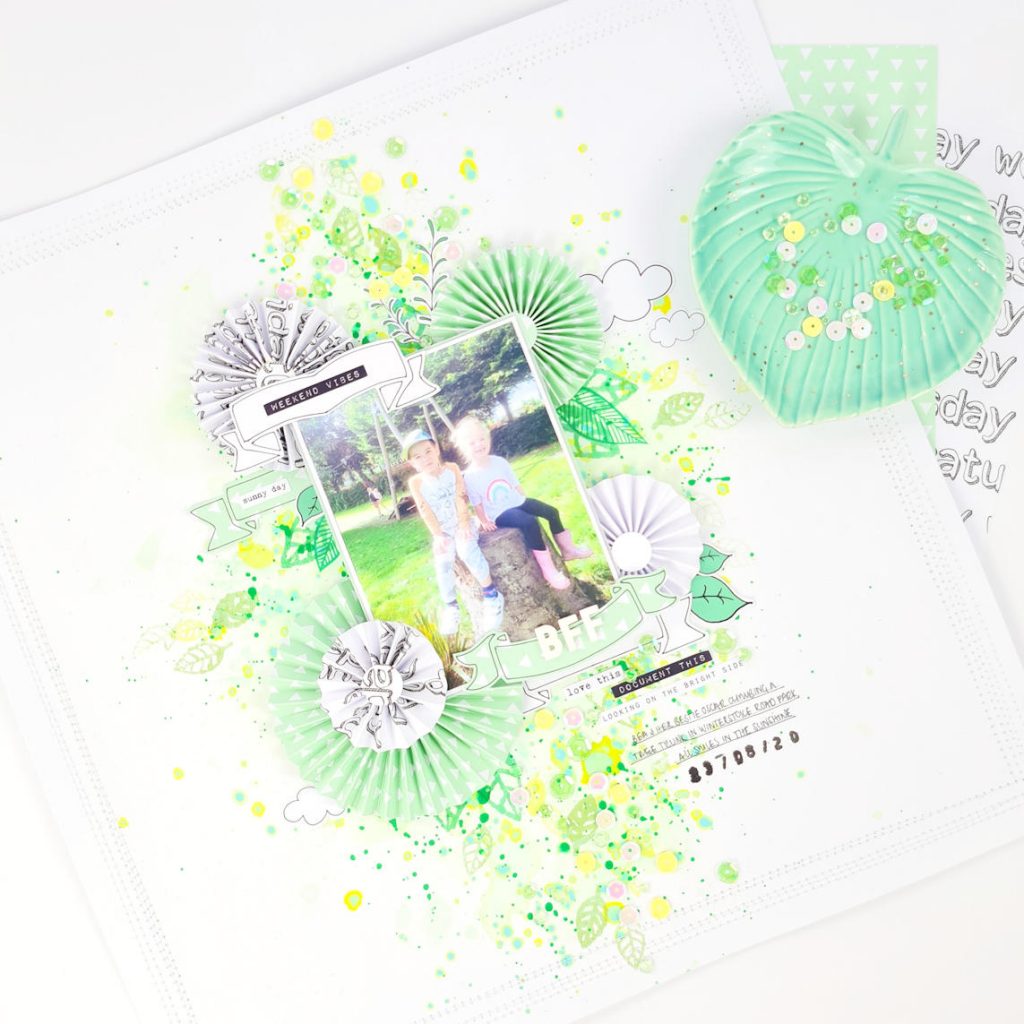
Using all the elements I created, the stickers in the kit & my photo I began the arrangement of my layout placing most things in the central third of my page, once I was happy I adhered them down with wet glue & foam tape. I felt like the outer edge of my layout needed something extra so I machined stitched lots of white thread, overlapping borders.
.
.
To finish I added a sprinkling of the sequins & some from my own stash, plus my title & journalling using a black fineline pen. Hope this has given you some inspiration to try more dimensional elements whilst crafting, it can add so much to a layout!
.
.

How absolutely gorgeous Emma!! I really love a mixed media layout!! I love the colours you’ve used!! And I love a Rosette!!!!