Take Me Away – Guest Designer Claire Murphy
.
Today we have Claire Murphy kindly guest designing for us, using the July ‘Take Me Away’ kit which you can see here.

.
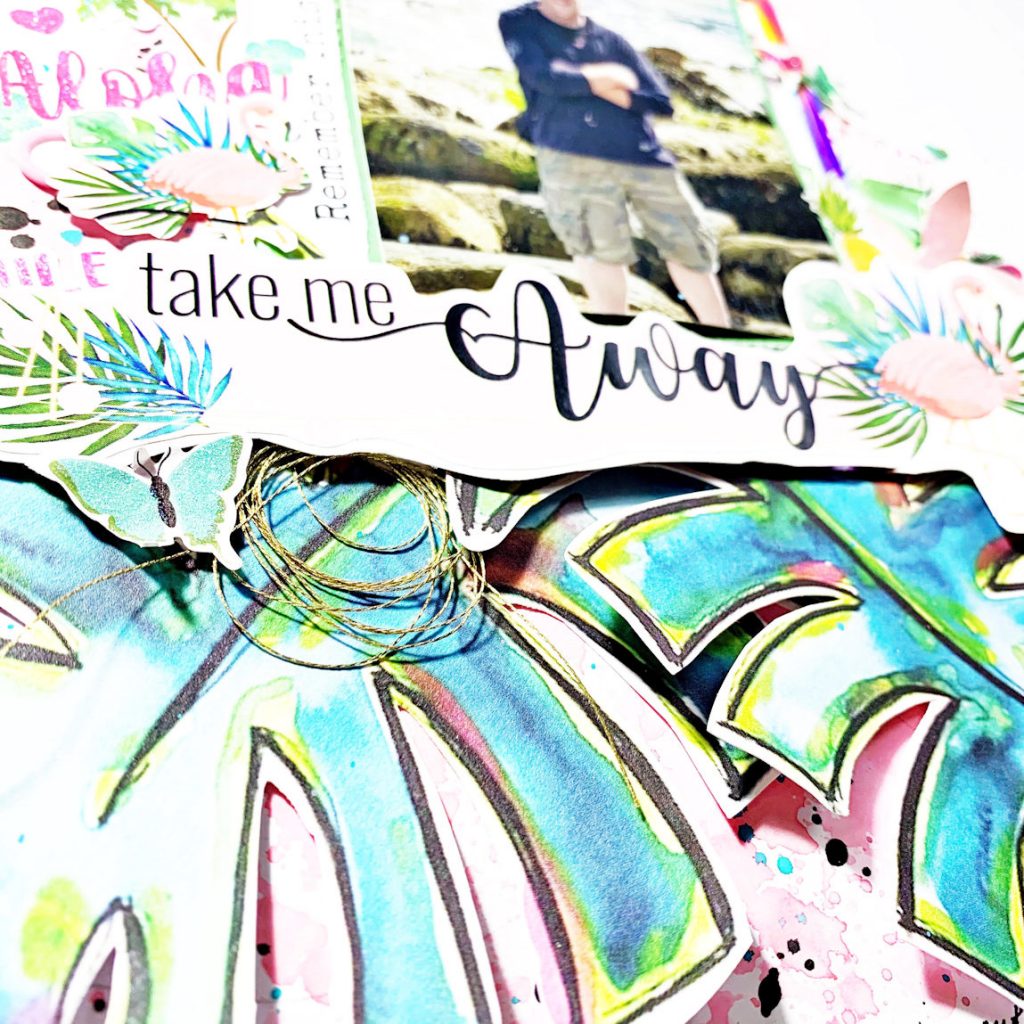
When I saw the papers in the kit I knew I wanted to fussy cut the large leaves and create a feature on my page with these. I grabbed a white piece of cardstock and added some messy mixed media in the background by putting some Distress Oxide ink onto some packaging (I used worn lipstick) and drew an outline of where my leaves and photo were going to go. I then applied the ink (with a little water) onto the cardstock and dabbed until I had a messy look. The important thing to remember is that it’ll look a hot mess until you lay everything back down so I wasn’t worried about what it looked like at this stage. I then added some ink splatters using Distress Oxide ink in Peacock Feathers and some splatters of black using Indian ink.
.
.
I tore from the box the letter that was attached to the lid as I wanted to use the “Take me Away” as a title so I fussy cut around it, added it to a piece of white cardstock and trimmed around that again. I added this on top of the leaves with some craft foam underneath to give it some height and dimension.
.
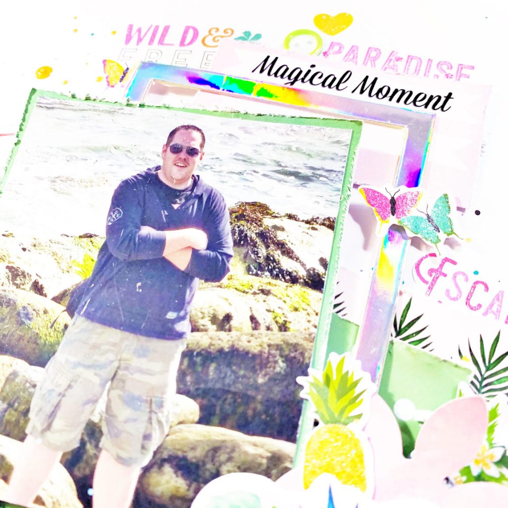
I tucked a few of the little embellishments around the layout including the holographic frame which worked well as a frame under my photo. I used the little emery board in the kit to give some texture to the edges of the patterned paper behind my photo and the little ephemera pieces from the kit. This is one of my favourite techniques.
.
.
Next I went to town with the little stickers. Some were popped up on foam and some were applied straight onto the background. I wasn’t worried about clustering my embellishments too much on this layout. I just focused on having everything together and surrounding the photo.
.
Since my design had taken a vertical line I decided the best place for my journaling was at the bottom just underneath the leaves.
.
Finally I added some gold thread (from my own stash) into a couple of areas and added some gold Heidi Swapp colour shine to finish it all off.
.

.
Claire x
https://www.instagram.com/scrappynerduk/

Leave A Comment