2 Pages 1 Kit – Creative Journaling with Chloe
.
Hi Everyone, Long time no speak! I’ve had a little break from the creative team as I was unfortunately very poorly, but thankfully I’m feeling much better now! I’m back today with some creative journal pages (of course, my standard creation) using the April Secret Garden kit. I wanted to show that you can use the same kit to create two very different pages/colour palettes.
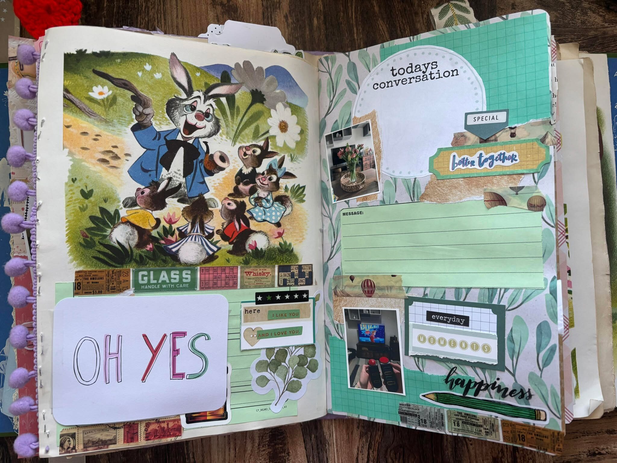
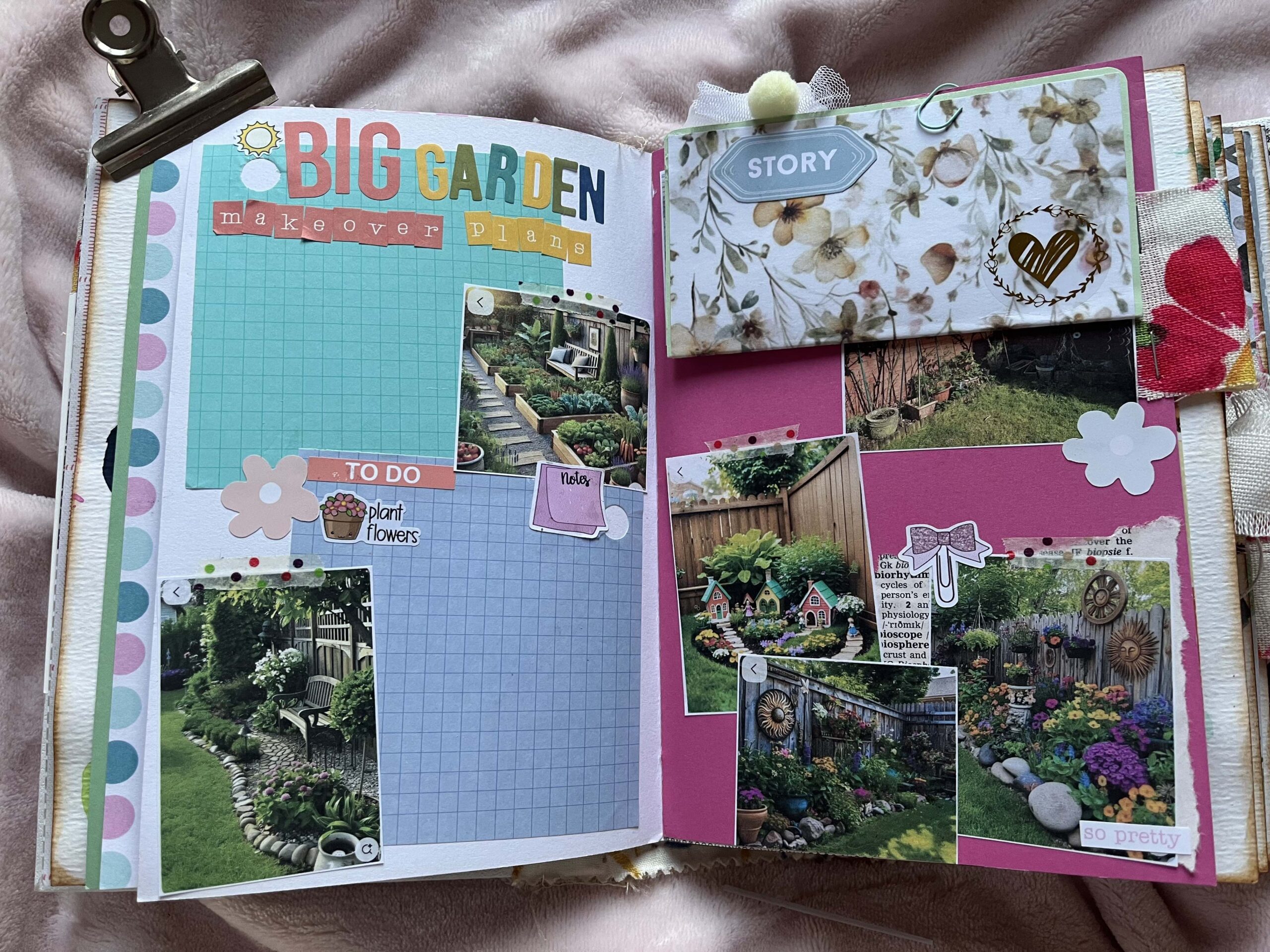
This first page focuses primarily on the floral elements from the kit, and uses a mostly green/yellow colour palette. I absolutely loved the floral/sunshine paper, so I created a layout of sorts on the right-hand side, entirely covering the page with the paper. I backed my photos with another patterned paper from the kit, and then used the DIY leaf embellishment supplies to create some watercolour leaves. This was super relaxing and it was fun to create my own embellishments! I used a black pen to add detail, and cut them out to add to my embellishment cluster. I finished off that little section with some word strips from the kit.
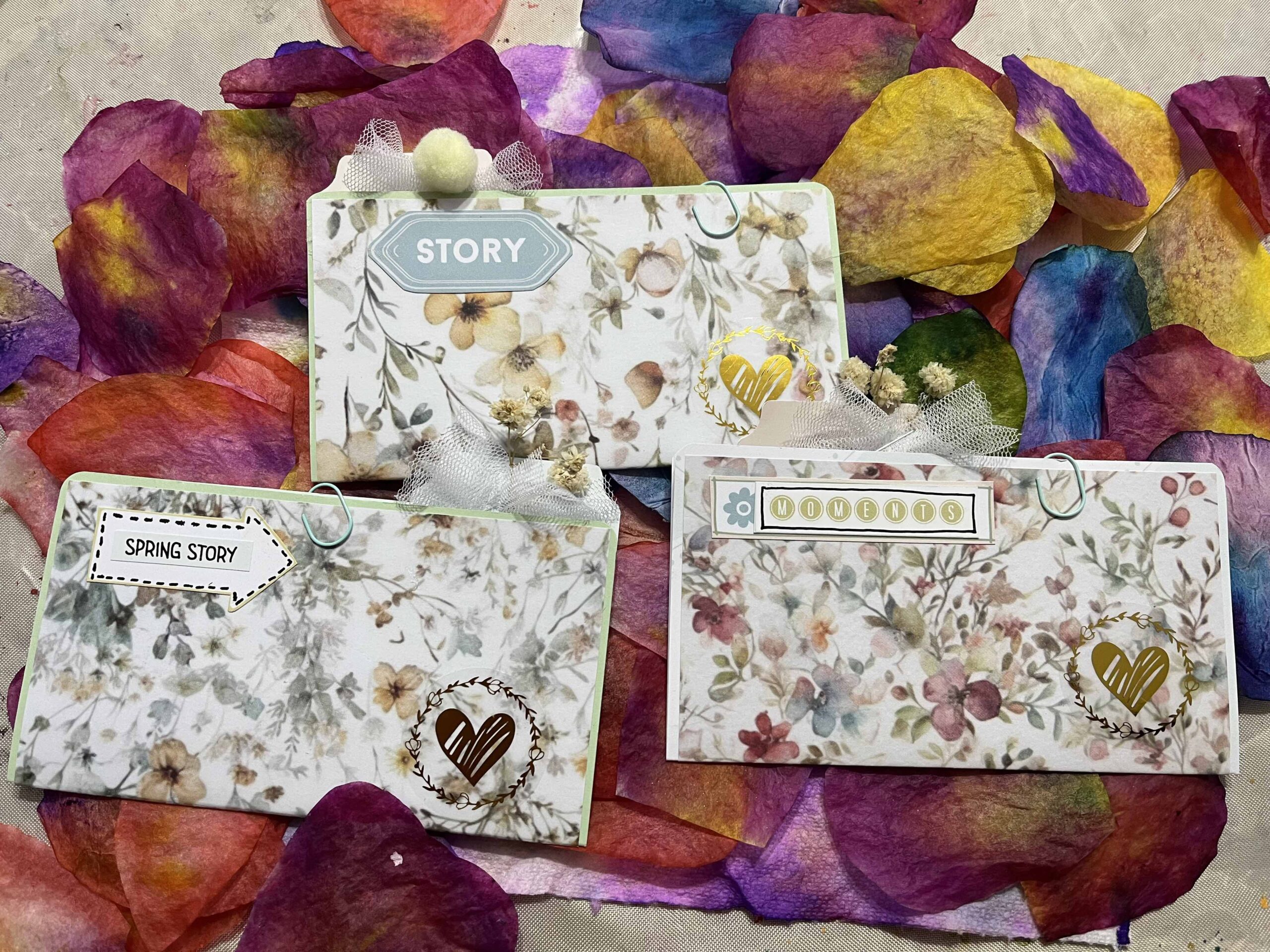
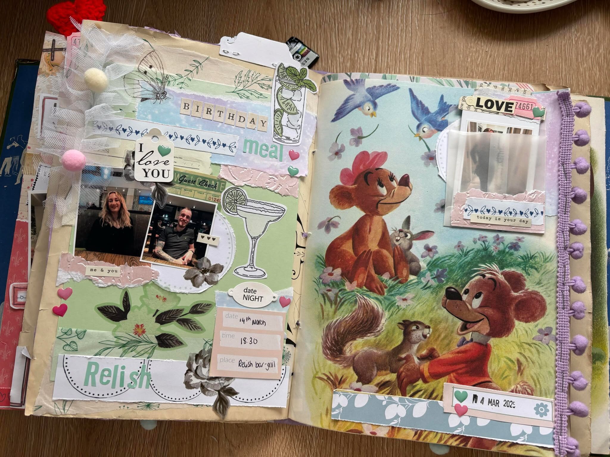
As you can see, this second page is incredibly similar in format (it’s only missing the flip-up element!) but it looks very different. This is because I pulled an entirely different colour palette from the kit, this time focusing on soft pinks and vintage neutral shades. The cluster on the bottom right page is made up of packaging from the kit, as well as some torn book paper. This page documents a play that I went to see as part of my MA dissertation research last year, so book paper was perfect for this theme! I used some washi from my stash, and some word stickers from January’s kit You Are A Wonder Woman. I also popped a tag into this little makeshift envelope, to add further journaling or photos.

Leave A Comment